.png)
.png)
.png)
.png)
.png)
The Swifter Labs Management Dashboard is a comprehensive tool designed to streamline project oversight and optimize team performance within an organization. It provides real-time visibility into project progress, team productivity, resource allocation, and key performance indicators, empowering managers to make informed decisions and drive successful project outcomes. This is a proof of concept project that is planned to be expanded.
.png)
The Dark Blue Style Guide is meticulously crafted to evoke a sense of sophistication and clarity, with the primary colour #130C87 playing a central role in establishing a commanding visual presence. This deep, rich hue exudes authority and professionalism, making it an ideal choice to represent the brand's identity. Complementing this commanding shade are the lighter secondary colours, which add depth and versatility to the overall palette. The vibrant tones of blue, ranging from serene sky blues to vivid azure hues, inject energy and dynamism into the brand's communications, while the subtle touch of off-white offers contrast and balance.
Each secondary colour in the palette serves a distinct purpose, from accentuating key elements to providing visual hierarchy and enhancing readability. #0686DD and #00B2FF infuse a sense of freshness and innovation, reflecting the brand's forward-thinking approach. Meanwhile, #ACEFFF introduces a soft, calming tone, perfect for creating engaging and approachable content. Finally, #F9F9F9 offers a clean and modern backdrop, ensuring that the design remains clear and impactful across various mediums. Together, these carefully selected colours form a cohesive and versatile palette that embodies the essence of the Dark Blue Style Guide.

.png)
The Sitemap for our platform encompasses a concise yet comprehensive structure, designed to streamline user navigation and optimize accessibility. At its core, users will find essential sections such as Team, facilitating collaboration and communication among members; Projects serving as a centralized hub for managing ongoing tasks and initiatives; and Messages, providing a seamless channel for real-time communication and updates. Complementing these fundamental components are Calendar and Billing, offering intuitive scheduling functionalities and seamless financial management. Lastly, Analytics empowers users with valuable insights and data-driven decision-making capabilities.
Meet Jason Patterson, a driven entrepreneur and adept leader who spearheads his own business venture. As the manager of a team comprising approximately 20 individuals, Jason embodies a multifaceted role, balancing strategic decision-making with hands-on guidance to ensure the success of his enterprise. With a keen eye for innovation and efficiency, Jason navigates the intricacies of business operations while fostering a collaborative and empowering work culture within his team. His UX persona reflects a need for streamlined tools and intuitive interfaces that facilitate seamless communication, task management, and performance tracking, empowering him to effectively oversee his team's endeavors and drive business growth.
.png)
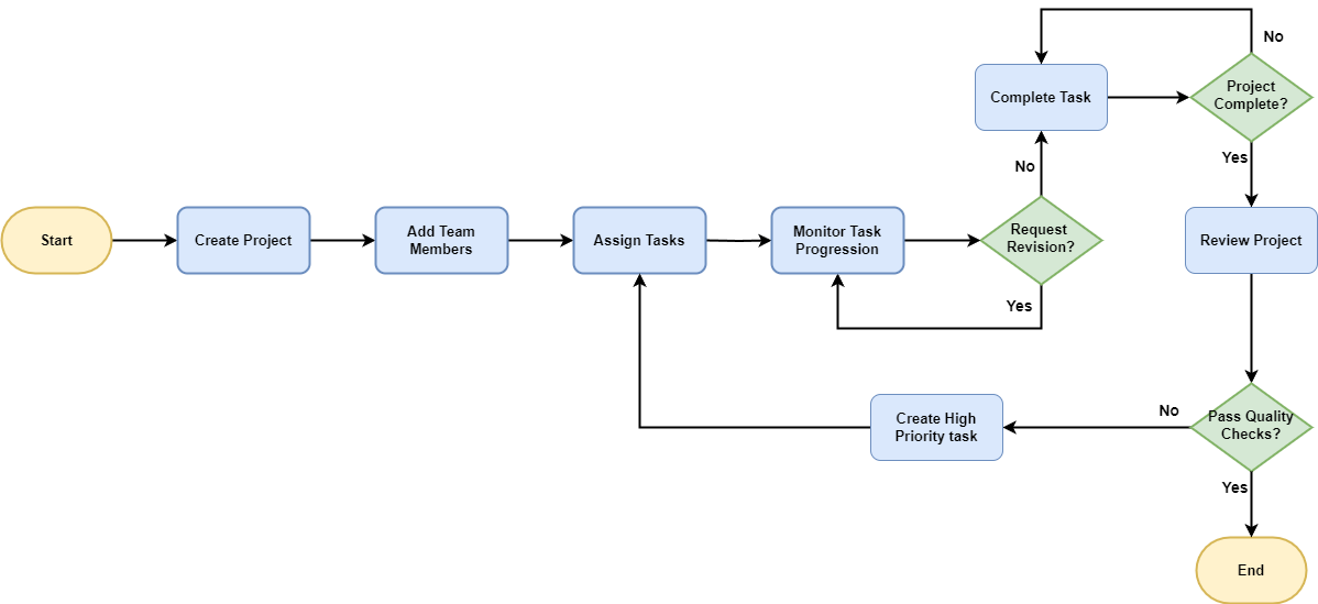
The process flow begins with Create Project, where the project initiation occurs, followed by Add Team Members to assemble the necessary workforce. Next, tasks are allocated through Assign Tasks, and progress is monitored in Monitor Task Progress. Should revisions be necessary, the flow loops back to Monitor Task Progress. Once tasks are completed, they move to Complete Task. If the project isn't complete, the flow loops back to Complete Task for outstanding tasks.
Upon completion of all tasks, the project moves to Review Project to ensure alignment with objectives. If quality checks pass, the process ends. If revisions are required, the flow loops back to Assign Tasks. through Create High Priority Task. This iterative process continues until all tasks meet the required standards. Once the project is reviewed and passes quality checks the flow ends.
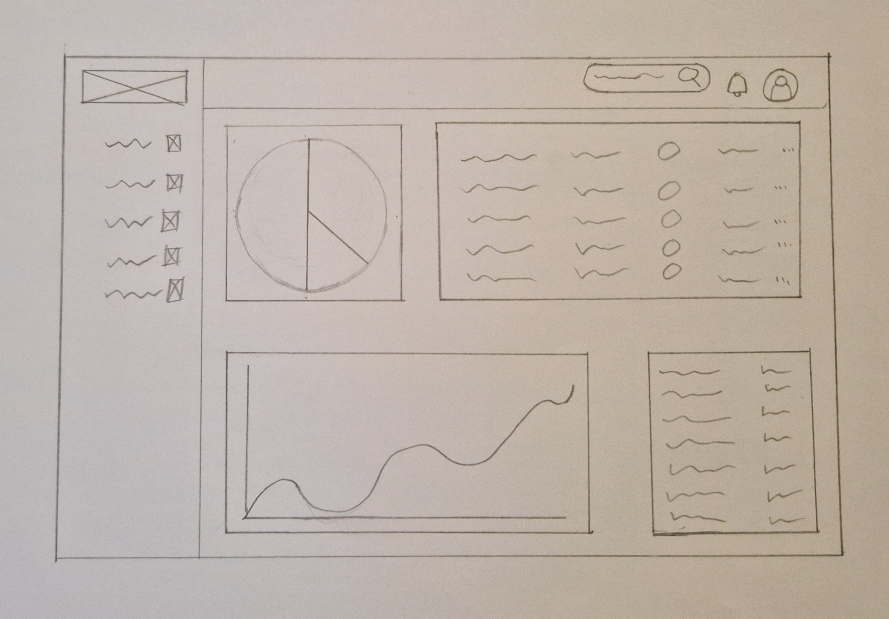
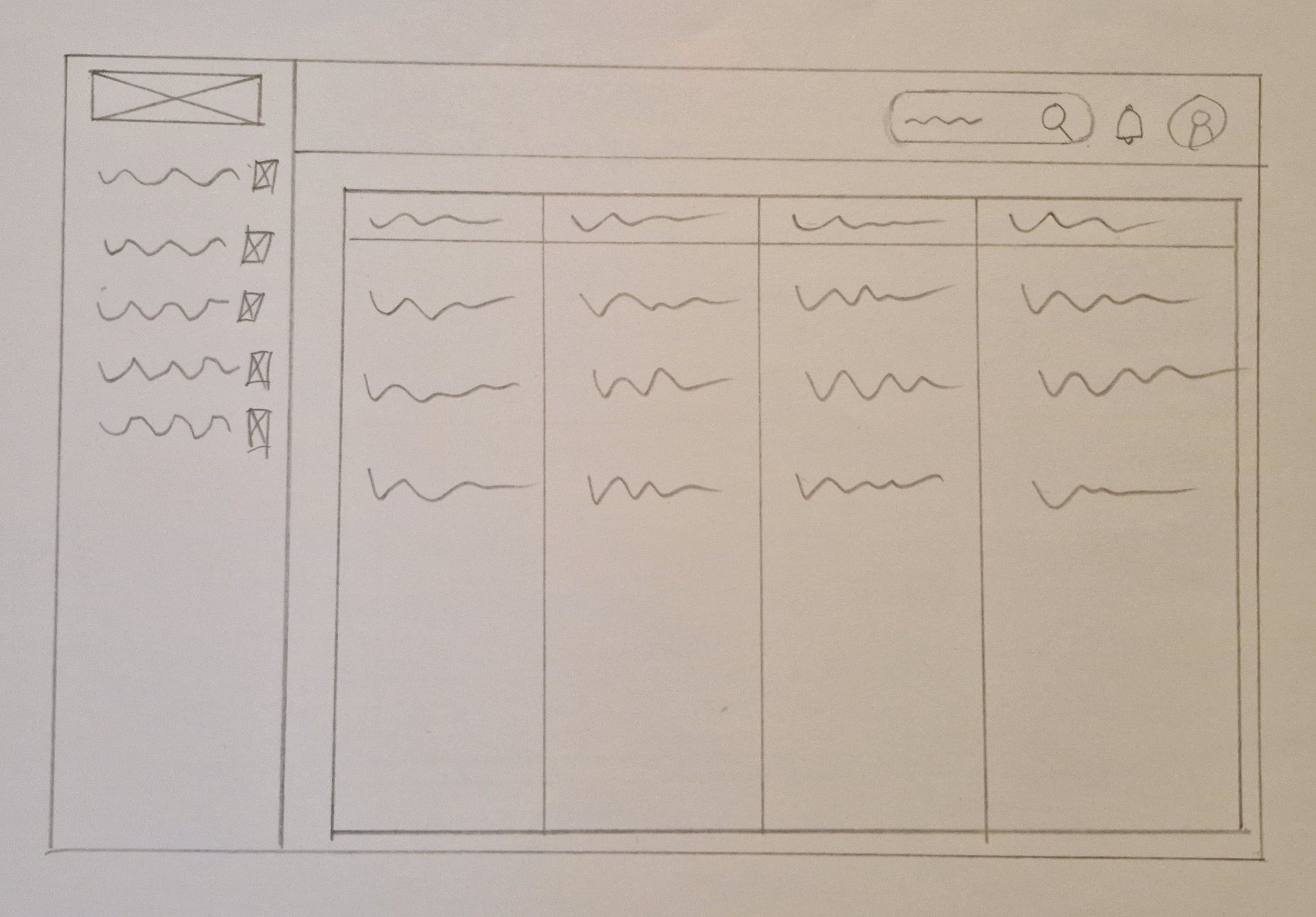
The wireframe for this dashboard features a user-friendly layout with a navigation menu positioned on the left side, ensuring easy access to various sections and functionalities. The main section of the dashboard is designed to accommodate a mix of large and small cards, displaying textual information and visual representations. This arrangement optimizes the use of space, allowing users to quickly grasp essential data insights and navigate through relevant content effortlessly. The combination of text and visual displays enhances data comprehension and user engagement, providing a comprehensive overview of key metrics and information. With a clean and intuitive design, this wireframe prioritizes usability and accessibility, empowering users to efficiently manage tasks and make informed decisions within the dashboard environment.
.png)